Monday 30 November 2009

Creating Shadow in Illustrator

I recently posted some fabulous examples of the work of Logyu/ Milk on this blog and the page that I'm working on at the moment is clearly influenced by her (well at least the tentacle is), so I thought I'd take this opportunity to run you swiftly through a tutorial which I reckon is pretty close to the methods that the girl herself uses on much of her work.

Illustrator at first come across as a horribly anal way of creating artwork, everything has to assembled by you working with a pen tool which creates vectors with weird little axis on them and the whole process to begin with can seem horribly daunting. But persevere and it all gets a lot easier and the results are just so rewarding. It has a natural elegance and crispness about it that Photoshop can never achieve and because you are working with vectors and not jiggedy jaggedy bitmaps the resulting artwork can be blown up big enough to cover the Empire State Building without any diminution in crispness.

You can really create a lot of very painterly effects with Adobe Illustrator using a combination of vector gradients and transparent layers and for today's exercise I'm going to show you how you can easily add modeling to a face without getting bogged down in the whole process.

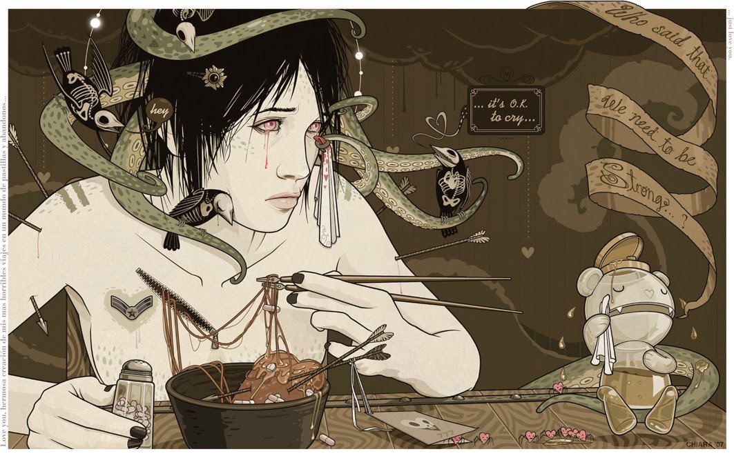
So, OK lets start with just the line drawing which I've coloured in by using the selection tool , either one at the top of the tool box on the left side of the screen will do. You'll note that I've had fun adding in some hair highlights already with a fill colour of dark blue leaving the outline blank, check out the bottom rectangles under the hand and magnifying glass icons in the toolbox. See there's a blue rectangle - that indicates your fill colour and see there's a box with a square cut out of it and a red diagonal - that's your outline and the red diagonal tells you it's empty.

So what you do is start drawing in with your pen tool a purplish tone (least that's what I've gone for) on a new layer and here's the fun bit - in the transparency tool box on your right, having selected the purplish area (note the highlight around the area concerned) make the transparency property multiply rather than normal and hey presto you can now see through the thing. If it's too dark just take the opacity slider in the same panel and push it around until you are happy with the appearance.

Then work around other areas of the face, using the principle of less is more, so don't get too bogged down with this. The area under the girl's lips I made slightly darker at 39% opacity as opposed to 21% opacity for the softer zones of lighting on the face, but your needs might well be different so don't be afraid to experiment.

The areas around the eyes again are even darker and a deeper purple and again don't be afraid to try out different looks to get the effect you require.

Lastly and on a different layer again, so that you can knock out the eye icon in that layer in the toolbox and check the before and after effect, create the effect of light hitting the lower part of the face. This in the context of this illustration is very important, it hints at props which are out of screen, in this case the rather macabre Gothy type drapes that hang in front of the screens in the cyber lounge and also concentrates the viewer's attention onto the girl's somewhat wistfull expression - hey if it's good enough for several generations of 'noire'esque' film directors it's good enough for us. So instead of dropping in light - it's already there - just add in the extra shadow over the eyes and round the nearest edge of the face, under the chin etc, etc until you have just consolidated the new area into a convincing whole.

And hey there we go a little bit of light and shade all adding to the story.

Not as daunting as it first seemed!

Sunday 29 November 2009

Jim Steranko Part 2


Well after reading Dave Morris's comment I couldn't resist and here for Dave and the rest of you comic book devotees are just a sprinkling of additional and in many ways seminal images from the genius otherwise called Jim Steranko.

There's a cover with very obvious Salvador Dali references and a couple of pages from two Nick Fury tales, "Who Is Scorpio" and the wonderfully titled "Dark Moon Rise, Hell Hound Kill" and then a page that is frequently offered up as an example of Steranko's mind numbing artistry from Captain America No. 111 as an opiated Bucky slips through the portals of a nightmarish unconsciousness. Marvel editor Stan Lee's very creatively orientated approach to comic artists such as Steranko was to give them the outline of a plot and then let them write and illustrate it, which someone with the creative flair of Steranko was more than happy to oblige. An incident such as this which might otherwise have just taken a panel or two becomes a full page tour de force with lots of very hip for the time (1968) references to mind altering substances.

The repro is from a not brilliantly recolored edition that Marvel put out in 1984, if you want to see Steranko's Captain America artistry at it's optimum best then arm yourself with a copy of Marvel Masterwork's Captain America Volume 3 and a Nick Fury volume with Steranko's art is due out next month in the same series. I did try and get the Captain America Masterwork on the scanner but I would have pretty much needed to dismantle the book to get a succesful scan which is why you have the relatively crap 1984 edition instead.

Go get the Masterwork edition before it goes out of print and becomes horribly expensive - you won't regret it - promise!!!

All images © Marvel Comics 2010

Jim Steranko


Well it's Sunday, I've slept in as a consequence of two nights down our local (not something I make a habit of but fun on occasion) but as a consequence I am in a bit of a blogsville kerfuffle.

So I'm going to use this as an excuse to run some more of my all important influences past you guys. This is stuff that burned it's way into my subconscious from an early age and even though I wasn't that gifted in terms of draughtsmanship, these were the guys that I wanted to emulate and I did spend endless hours soaking up their collective genius.

Pre-eminent amongst a new wave of comic artists who sprang onto the scene from the mid sixties onwards was a phenomena by name of Jim Steranko. By the time the twenty seven year old Steranko first entered the world of comics, he had already done a lot of living. Having grown up in grinding poverty Steranko had realised that the only way forward was to push himself into the light by dint of his own resources as he was getting precious little encouragement from home. Consequently he devised every means possible to develop his talents, teaching himself to draw by copying newspaper strips onto discarded envelopes which he flattened and then drew upon, then funding his art materials by collecting empty soda bottle for the return of the deposit on them.

He studied his father's books on magic and hired his talents out to circus's and carnivals, developing skills as an escapologist, illusionist and fire eater. Inheriting his father's musical abilities he also performed in a rock n' roll band frequently sharing the bill with Bill Haley and the Comets, where Haley's guitarist and the teenage Jim became good friends.

He then further developed his graphic skills working for a printing company in his hometown of Reading, where he designed flyers and posters for local dance halls and the like. After five years he moved on to work in an advertising agency desiging layouts for a variety of ads and campaigns.

Compared to the average twenty seven year old now, who most likely will have completed a three year university course and nowadays an additional post grad, with perhaps a gap year thrown in and a couple of internships, Steranko comes across as someone with a CV that puts him into the super league.

It was his ability to think beyond the confines of what was the accepted norm for comics art that made Steranko's work so exceptional and like Barry Smith who I mentioned in an earlier posting although he was hugely influenced by the work of Marvel's premier super hero artist Jack Kirby it was what he then did with those influences that so attracted the fanatical fan response to his artistry.

Steranko's restless nature was however already pushing his work in new directions and the tenure with Marvel comics was short lived but the work he created most notably on Captain America and Nick Fury was such that it is still being reprinted and talked about today. He subsequently went on to found his own publishing company, pursue a career in illustration and provide concept artwork for a variety of Hollywood films.

He did work at a variety of other comic projects that were destined to remain unresolved and
following in the wake of the revival of Sword and Sorcery Sagas he created some fabulous concept artwork for a Conan'esque character named Talon, which I'm going to run past you now.

In the meantime I've missed my self imposed deadline as page 19 was supposed to be completed yesterday but I'd overlooked the fact that I needed to complete my VAT return but what the hell! Nearly there.

Saturday 28 November 2009

Forensics

A couple of years ago I had the fun of working on a graphic novel adaption of three "true life" murder cases, in which forensic science was a key factor in the successful prosecution of all three defendants. There was a lot of work, thirty two pages in all and a reasonably tight delivery date. But what helped the process flow was that Gary Jeffrey, the guy who was art editing the whole enterprise was a consummate layout artist with an abiding passion for film.

Upon acceptance of the commission, I was supplied with dozens of really helpful bits of reference covering costume details, architecture, character suggestions and on top of that Gary had as already intimated created detailed page layouts for every page of artwork.

Consequently the job was a real delight to work on and it was one of those jobs that in a weird kind of way gave me the confidence to undertake the artwork on Cloud 109 utilizing the same techniques I had employed on the forensics job, even if I had to go it alone without the aid of Gary's superb layouts

Friday 27 November 2009

A Matter of Timing

It's one of those mornings when I wake up to the feeling that I'm not really going as all out as is required to make my self imposed deadlines. So time to set myself some real deadlines numero uno being that I'm going to get page 19 completed by tomorrow, whilst still working on the horribly involved comic strip that I am doing for The Royal College of Anaesthetists. This is yet another of those jobs where everything has to go in front of a committee all with their own particular ideas on gender, ethnicity and disability, which when I look at the brief they have supplied me with leaves a lot of these decisions that I know are important to them, entirely open to conjecture. Bit like being sent into a minefield with a broken stick and a rusty penknife and a blindfold to help you on your way.

So here we are with page 19 - not much further on since yesterday's posting, I kind of rewarded myself with another go at it last night after a day's work on paid projects, but as it progresses you will see where this thing is going - promise!

In the meantime here is another little item that I've been working on, namely the graphics for Mr Oliva Spleen's new(ish) band Pink Narcissus. The first time I was made aware of Oli was when I read a review by a girl who had seen one of his gigs during which like some depraved prestidigitator, he produced a length of salami sausage from his posterior bit half of it off and flung the rest into the audience. After that, as she said, she was hooked. The second occassion she witnessed him in action, she was initially somewhat disappointed as he seemed kinda restrained in contrast to his previous performance. However her spirits were raised when it became all too apparent that the reason for the restraint was an attack of biliousness which was relieved when he commenced projectile vomiting over the audience and then launched himself off the stage and onto the now very slippery floor.

I've not as yet plucked up the courage to attend one of Oli's performances but I gather from my younger son Tom that he has toned down considerably on some of the more audience challenging aspects of his artistry. However the somewhat grumpy old geezers that did form his previous band have now (for understandable reasons) all left and Oli has recruited a new squad of bright eyed young men from a local music college - hence the need for the new graphics. I still don't think you're going to be seeing them on the X Factor anytime soon.

Talking of bands brings me circuitously back to the theme of timing, graphic novels, film, music - it's all a matter of timing. Getting your stuff out there at the right moment - art is always reacting against what has preceded it - get it wrong and your yesterday's papers - to semi quote Joe Strummer. Nowhere is this phenomenon more apparent than in rock music and no band has been a greater exemplar of the vicissitudes of bad timing than Eddie and the Hot Rods. A bunch of teenagers hailing from the same neck of the woods as Dr Feelgood, they burst on the scene in late 1975 and as they were even louder, younger and looked like the answer to a young girl's prayer (which arguably the Feelgood's didn't) they were hailed as the future of rock n roll and snapped up by Island Records. They had a wonderful three year career but even by 1977 the gloss was beginning to wear off, as by then the next phase of the reaction against the excesses of Emerson Wake and Palmer, Yes, Focus, Edgar Winter and all the other dinosaurs of prog rock had well and truly burst on the scene and The Sex Pistols a little known band that had supported them on one of their early gigs and trashed the Rods PA in the process, were now the arbiters of U.K. Punk style.

Timing is all and with that here's the Hot Rods still with the light in their eyes filmed in late 1975 at the Kensington Pub (one of the key venues at the time) with their totally brilliant harp player Lew Lewis - who sadly was ditched a few months later for just being too out of it for too much of the time.

Enjoy...

Thursday 26 November 2009

How To Make A Living Out Of Illustration (?)

I've toyed with the idea of putting a posting up on this subject for some while and I thought in the end "Oh Gwannnn - Why not???" It is painful though and I'm probably going to have to break off typing from time to time to dry away the tears.

The catalyst for my making this posting today was reading last night about the fees that Roy Cross earned in the mid 1970's when he was producing his superb aeronautical paintings for the U.K's leading plastic kit manufacturer Airfix. The last two paintings he sold them commanded an overall fee of £595.00. Now whereas that isn't a huge amount of money in today's terms in mid seventies terms that was pretty good going. There you had a master craftsman who was being generously rewarded for his labours.

Nowadays there are an awful lot of illustrators producing works of similar demand and complexity for exactly the same fee and sometimes less, much less than that. The Association of Illustrators recently ran a survey on illustrators earnings and the majority of them (some 80%) were earning less than 20K per annum.

There are a few illustrators that I know who do through being as much businessmen as artists manage to earn a relatively good crust from their labours and a few a very few do occassionally head towards the six figure mark. But to do that you have to not only tailor your style to the market (difficult at the best of times), but you also have to be driven to the point of obsessiveness with regard to working every hour that God sends you all the while praying that you can repeat the same trick for another year to met the huge mortgage you now find yourself saddled with. I've been there and done it and I can say that while you might get a certain short term buzz from being Mr Breadwinner Par Excellence, the truth is that it is a horribly uncertain way to make a living and you do know that eventually the fickle market will be looking elsewhere
while you stress about the shortage of work you now face.

The reality is that illustration fees are at an all time low, I can say this with confidence as I am not just drawing on my own experience but those of a lot of other colleagues. Essentially it's a buyer's market out there and even illustrators agents (I will take my courage in both hands and do a posting on that vexatious subject sometime soon) are putting in low quotes in a desperate bid to keep some of their now insanely huge stables of artists semi occupied.

So to any students of illustration reading this, try to acheive a paired down life style, keep your overheads as low as possible, work for cash in hand clients as often as you can and just have fun developing your own ideas, so hopefully you can acheive creative fulfillment without having to ever pay of that friggin loan that a bunch of politicians who never got off milking the public purse since they went off to university on full grants have stiffed you with.

And talking about illustration students here's a film that Sheryl (Gina) recently appeared in - pretty weird and dark stuff...

And talking about dark stuff the above bits are page 19 of Cloud 109 in progress...

Wednesday 25 November 2009

Cloud 109 - The Eighth Instalment

Well it's that time of the week again when we get to catch up with Gina, Cary and Rabby who at the moment are trying to work out what's going wrong with the cyber world where they spend so much of their free time. So far they've been wigged out by steel toothed mini zombies and the Cloud 109 cyber lounge itself has been attacked by monsters from Dimension X.

What's going on?

Here's the previous page plus today's offering and all previous episodes can be viewed on this blog.

You will also note the gaming gloves which you can see a little more detail of, these are an integral part of virtual gaming as you will discover during the course of the trio's adventures.

As a note to the curious, there's a lot of references to real people, in fact to varying degrees everyone in this strip is real. It's part of the playing with perceptions of reality which David's script is predicated on. The Black Veil poster is an earlier incarnation of my eldest son's, currently living in New York, band. The photo was taken in one of their previous abodes which was a converted warehouse full of wannabe artists, poets and musicians all living the life but needs must as they needed to get their overheads down having just done a runner from a bunch of very scary Sicilians from whom they had rented their previous apartment.

It seems like scant weeks ago since we were worrying about the little lad's GCSE's.

Tuesday 24 November 2009

Dwellers In The Dark

As mentioned previously the first extended games sequence in Cloud 109 is 'The Dungeon of Death' game, where Cary intends to pick up several hundred easy credits via some cheats that his I.T. pal Matt has supplied him with.

Things do not go strictly to plan and things start to go horribly awry for the team. The pages that I am working on were in David's original script an extended and very entertaining dialogue with the team stuck in a deep dark dungeon but the humour was all in the exchanges between each of the principle characters and the remains of Kevin, one of the long lost previous players of the game.

In terms of making the thing work visually I felt that I needed to add in a bit of extra business to underline rather than detract from the humour in David's script. This provided me with a great opportunity to add some references to earlier examples of what used to be referred to as 'sword and sorcery sagas'. The monster that greets Gina, Cary and Rabby when they restore a little light to their darkness owes much to some of the more disturbing creatures that inhabit the depths of a now ancient computer game called "Dungeon Master" in fact our creature is a combination of the dread purple worms, which infest certain levels of Dungeon Master and are hideously difficult to overwhelm but even they are small beer when compared to the puissance of the Beholder a floating wizard's eye that spits poison (one hit and your toast). So I thought I'd combine the two which is where our giant maggot comes from.

In addition and as a pre-cursor to the world of Dungeon Master lies the work of the brilliant but manic depressive American pulp writer Robert E. Howard and in particular his character Conan the Barbarian. Conan's world is beset by casual violence, manipulative women, evil sorcerors and at the end of it all unspeakable horrors usually lurking in deep dank and dark dungeons and this stuff was obviously as much a source of inspiration to the programmers of Dungeon Master as was the more high profile writings of J.R. Tolkein.

Conan was first projected into mainstream consciousness by the masterful cover artistry of Frank Frazetta who created iconic images for most of the paperback reprints of the Conan saga throughout the late sixties, but it was the superb artwork of a young Englishman Barry Smith combined with brilliant adaptations by Marvel scribe Roy Thomas that made the lasting impact when Conan was launched as a monthly comic by Marvel in 1970.

These comics were utterly brilliant and it was a real joy to see the maturing style of the then very young Barry Smith as he commited himself with unparalled devotion to this project. Here's a couple of pages the colour sample is from 'The Tower of the Elephant' and the greyscale page is from 'The Dweller in the Dark'.

Lovely stuff eh?

Monday 23 November 2009

Colour Coding Cloud 109


One of the considerations I had to make when first deciding how to do justice to the script that David had produced for Cloud 109 was double underlining the identities of each of our principle three characters, so that no matter how often they changed their image or game gear as they go from one form of 'reality' to another it would be immediately apparent who was who.

The solution I eventually lit upon was simple and blindingly obvious, in addition to the gear that they wear acting as a projection for their personalities, Cary's a bit nerdy and it certainly shows in his choice of apparel, whereas Rabby's more your all round action type of guy and Gina's got this Goth chic thing going which perfectly matches her cool knowingness, I also included colour coding as the final and definitive key to who's who in any given shot.

I decided right from the off to use solid black as a key throughout the styling - the main reason is that as the style of drawing throughout is linear, using solid black for areas of hair and clothing avoids the business of drawing in black areas of shadow without sacrificing the necessary punch I was seeking to achieve. Tonal dynamics being thus resolved, it was therefore very easy to drop in just one other colour for each of the characters. Gina is red, Cary is green and Rabby is yellow. This colour coding approach opens up a lot of creative possibilities and just adds to the creative fun of the process.

However and with some degree of irony 'Cloud 109's first printed outing is going to be as a black and white teaser comprising the first quarter of Book 1 in Jordan Shiveley's excellent and highly recommended Hive anthology the current issue Hive 3 is out on sale as I type and we are scheduled for the following issue. I've checked over the pages and even in black and white for this sequence David's rich characterizations of Gina, Cary and Rabby work well enough to overcome the loss of the colour coding idea.

Meanwhile and just to prove to you guys that we're still beavouring away feverishly on 'Cloud 109' here's a couple more pages in their rough incarnations and as you can see they are still in deep dos.

Sunday 22 November 2009

Manga Style

Here's my first ever attempt at working up a Manga style character, it was done for a soft drinks firm and the brief was to create a variety of kids in different drawing styles and in desperation I launched myself into learning Illustrator on the back of a Computer Arts Mag tutorial which neatly explained how to create a Manga style character using Illustrator as your principal drawing tool. This little beauty was in many ways the inspirational touchstone for the kids that would ultimately inhabit the myriad worlds of Cloud 109, the ongoing graphic extravaganza being lovingly crafted by David Orme and myself.

I will admit that while I love certain aspects of what is referred to as Manga, there is a lot of it that leaves me cold. At it's best it's a real transport of delight and I have to admit when it comes to Japanese animation and the works of The Studio Ghibli I am totally in it's thrall.

But at it's worst and there's a lot of worst out there, it simply seems to feed on itself, repeating an overly formulaic approach to storytelling and characterization. When it gets exciting, as in all creative endeavours, is when the artist is sufficiently confident to be able to absorb what they require and then happily discard the rest of the friggin' rule book rather than be enslaved by it. There are some young British creators that are clearly influenced by Manga but still managing to do their own thing with great verve and panache, wonderful artists such as Emma Viecelli, Kate Brown and Paul Duffield spring immediately to mind and across the pond there is a really "other" artist by name of either Logyu or Milk who produces work which just takes your breath away. All I know about this woman is pretty much what it says on her MySpace - she's 33, originally from the Phillipines and is self taught. The fact that she is self taught should be a source of inspiration to young illustrators contemplating acquiring £20,000.00 and upwards worth of debt to put themselves through university where contact hours and lecture facilities are under downward pressure while their costs are spiraling in the opposite direction.

Anyway I digress, here's some of her amazing work and check out her MySpace too. She's going way beyond Manga, in her work you'll see references to Hokusai, Art Deco, Renaissance painting, Tattoo Art, Victoriana, Comic Art - just fabulous artwork.

Manga is a good starting point but it's definitely not the whole story - so be inspired and be yourself.

Saturday 21 November 2009

The Signwriter's Craft

O.K. I'm going to 'fess' up and admit to the fact that the muse of blog inspiration has temporarily deserted me and as a result you are going to be treated to yet another dalliance with some of the stuff that pointed me in the direction of not having a proper job but pursuing a career in illustration instead.

As I mentioned last Saturday, comics in the late fifties and early sixties were in the U.K. unbelievably good. There were comics aimed at a variety of young readerships and all of them featured really inventive, character driven strips with artwork which at it's peak was simply unbeatable. The comics were so good that frequently and certainly in our household, the first reader would be your dad.

Not all comics received such parental endorsement and there was one genre of comics in particular that were regarded with real approbrium by, if not your parents, then certainly your teachers. These were of course the aptly named pocket libraries which by this time were pretty much universally fixated with tales of derring do from the then still relatively recent Second World War. These comics were small enough to be carried in your school blazer pocket and carefully inserted into the pages of whichever text book was required for the classes you were so reluctantly obliged to attend - you can see why they were such a bete noire with the teaching profession.

If there was one particular line of these comics that were regarded with more unease than it's contemporaries, it has to be the then young contender Commando comics. They were the brainchild of one "Chick" Checkley an editor working in the juvenile division of Dundee based D.C. Thomson, Scotland's largest publisher of newsprint and periodicals. Inspired by the success of their southern rivals Fleetway Publishing's War Picture Library, Commando was launched by Checkley utilising the talents of many of the same writers and artists but adding in some of their local talents to advance the vision that Checkley had for imbedding his comic into every schoolboy's subconscious.

Pre-eminent amongst the Dundee based talent was the man responsible for several of the innovations that made Commando more than a mere imitator. Ken Barr was the man who came up with the distinctive stilletto logo and panoramic cover painting format. Apprenticed as a sign writer upon leaving school at the age of sixteen he was by the time he commenced work for Checkley an illustrator of formidable talent and drive who had a passionate regard for U.S. comics and pulp magazines.

And it was his ability to inject every cover assignment that Checkley put his way with an in your face over the topness that made Commando comics so distinctive. Classic Barr covers would feature demented Huns, in full Nazi regalia, buggin' eyeballs, clenched jaws, blazing guns and enough tungsten lighting to sear your retinas. The net result was sheer magic, his cover art screams non PC ... and it works in spades.

So here's some of those classic covers again for your weekend delectation ...

Friday 20 November 2009

Illustration By Committee

I'm going to stick my neck out a bit today and say a silent prayer that certain interested parties are not visiting this little blog of mine. I'm sure they're not as they're probably already in one of those things called "a meeting". However yesterday's running of the artwork of the guy leaping from the rooftop did bring to mind a somewhat painful experience that befell me whilst creating some of the artworks that helped land me the job with the New York Ad Agency in the first place.

I remember many years ago an illustrator of some experience and note giving a talk to a bunch of students about the travailles of working for advertising agencies, it was something along the lines of "the money is great but they're so picky and the work is always a stress". Not word for word but that was the essential import of her message. Her preferred outlet was the world of publishing, where she could enjoy the relative creative freedom that such clients offered her.

In contrast I've always found the world of advertising to be simple and straightforward, you work from an art director's rough and they tell you exactly what they want. In essence they're paying for your style and your professionalism i.e. they know you will deliver the goods and meet all those important delivery times. Couldn't be simpler and the pay is usually pretty good too.

Which brings me to the painful experience which concerned a couple of books I illustrated some years ago for a publisher's educational division. I should point out here that educational publishing is one of the most demanding and committee driven areas of illustration conceivable, it is for many illustrators a lifeline but it can also be the graveyard of any creative ambitions they once might have nurtured. Case in point being the two books I illustrated for said (and for obvious reasons un-named) publisher. Ostensibly it was a nice job with the hint of more to follow. Black and white illustrations for adaptations of two James Bond stories; "Dr No" and "Goldfinger". The manuscripts eventually arrived along with mounds of layouts, editors directions on what should appear in each artwork, references and delivery dates for roughs and final artwork. There were various stipulations one of which did concern me as it asked wherever possible to avoid using large areas of black.

This was destined to be the source of much grief later on. So I did all the roughs and shot them over in batches to the team, I also queried the not too much black as for me, some of the scenes by defintion were going to be pretty dark and the style I was adopting was very much in that gritty, graphic mode where solid blacks just add to the appeal of the whole thing. So I worked up a couple of the finished artworks and sent those over so they would at least be able to see where the thing was going.

And then I waited ... and waited ... and waited ... for comments to come back whilst nothing happened and the final immovable delivery date loomed ever closer . Eventually I did get comments back, loads and loads of them some involving major changes of viewpoint, others more straightforward but a lot of comments by diverse hands to be filtered through. Anyway juggling around with the usual other jobs I just piled into the artworks as quickly as possible and started batting them back to the art editor, who seemed to genuinely like what I was doing. However after a point a lot of the now "finished" artworks came back from the editor for further amendations and again changes of viewpoint in addition to those already requested. As time was now rapidly running out I will admit I dug my heels in and started to question the rationale behind some of the latest changes. The final trump was when late in the day the editor (as opposed to art editor) then requested that I leech out all the solid blacks from my drawings. Upon my enquiring why I was then informed that it was because the paper they were printing the books on was so thin it would create legiblity problems for the readers when viewing the reverse sides of the pages my artworks were to appear on.

The upshot of all this was that I was blacklisted by said publisher.

Advertising work in contrast is a breeze.

Thursday 19 November 2009

Putting It Into Perspective

Looking at the top image from yesterday's posting, reminds me of how daunting some drawings can seem. But often they are a little easier than you first suspect. For me the most essential thing when undertaking an extreme perspective view such as this is to find anyway you can of establishing the perspective. With the monster image it was the rain drops showering down that created the grid that I worked around and with those in place it was really easy to follow through with the rest of the drawing.

Here's the initial scribble that I did, really just concentrating on the monsters whilst establishing those all important perspective lines via the rain drops, I know I did a separate drawing for the figures but it has got lost somewhere in cyberspace but this is the guts of the thing.

There was another job I did for a New York ad agency earlier in the year, where again extreme perspective was called for. Here's my original pencil scamp followed by the Photoshopped tonal visual I presented to the client and here's the finished artwork. I wanted a really gritty feel to this thing and opted for a hand drawn approach which would capture the essence of my original pencil drawing and again Manga Studio (which retails for about £30.00 introductory version) came to the rescue. The art director's only request was could I make the walls further apart, I did and he came back with an even further apart request.

My sympathies were entirely with the jumper...

Wednesday 18 November 2009

Cloud 109 - The Seventh Instalment

Well it's that time of the week again where we get to find out what Gina, Cary and Rabby are up to. As you will recall the last time we saw them, the Cloud 109 cyber-lounge was under attack by some really out there monsters. Check previous week's postings to get the full prequel to today's post.

Interesting aside (assuming you're into the creative process of how this epic is being put together), page 7 of this story was one of the first pages I worked up as the idea was to see how well the varying styles which encompass the varying degrees of reality in the story were working. Overall I was pleased with this page but as time progressed I began to feel that the background did lack conviction and I decided in the end to use as much reference from the real Gina (Sheryl) as possible as the world appearing in this picture needs to have as much conviction as possible and particularly in the case of the posters on the wall they do inform the Goth chic of our leading lady.

I'll run the previous version past you as well so you can see the difference, so top artwork after last wek's page which I'm reprising as my usual aide memoire, is the new updated version and the bottom page is the original one. Note also the addition of the gaming gloves which I'll talk about a bit more when episode eight gets posted.