Saturday 30 January 2010

Sonic the Comic and Streets of Rage

This is going to be a bit like lying on a bed of nails but in an earlier posting I did mention that I had worked on I.P.C.'s fortnightly Sonic the Comic in the early 1990's, along with such comic book luminaries as Richard Elson, Jon Haward and Nigel Kitching. I also mentioned that I endeavored to produce one five page installment within a week's turnaround time, there were two reasons for this, firstly my overheads at the time were considerable and the page rate would only make sense if I could actually turn the artwork around pretty niftily. Secondly I still had other avenues of work to maintain and if I got completely bogged down in the comic work (which I did find very rewarding) I would louse up on the rest of my illustration practice.

Anyway as Dave Morris (the man behind the scripting of the epic adventure Mirabilis) expressed interest in seeing some of these pages, I've (ulp) finally dug out some samples which are moderately less embarrassing than the majority of the pages that I churned out. It was working on this strip that made me realize just how crap my figure work was and I have made sterling efforts ever since to try and redress this lamentable state of affairs.

Most comic strip artists it has to be said need to achieve a complete mastery of figure work before they can hope to express themselves fully, if you don't you are destined to spend copious amounts of time which you don't have struggling to make your figures work. This needs to be avoided like the plague, so attend life drawing classes, study anatomy (there are some first rate books out there and George Bridgman is as good a place to start as any.

In fact drawing from life is to be recommended all the time, you need to do this to avoid the pitfall which awaits all artists - no matter how brilliant they are of adopting aristic mannerisms when drawing figures. If something succeeds, you start to get comfortable with it and before you know it you're repeating yourself with faces and hand gestures being prime examples of this trend. Look at people in the way that a Martian would and see them free from your own preconceptions - if you want to experience the sensation of what can be achieved by this then you need look no further than the work of Lucien Freud.

Anyway here's a sample of a cover for the second Streets of Rage story which was scripted by Mark Millar and the first installment of the third and final Streets of Rage story written by Nigel Kitching. This one definitely took longer than a week, in fact ten days, the final page being a monster of a page in terms of drawing and inking. In some ways I preferred the pages in black and white, so on this occasion I photocopied the whole sequence before colouring it up with magic markers and body paint for the highlights. The paper I was using at the time was Fabbriano Watercolour Paper which was the best paper for attempting this slightly bastardised technique. Reference for a lot of this was relatively minimal as time was as ever pressing - nowadays courtesy of Google the scene setting shot would have been executed with a lot more conviction.

Now talking of Dave Morris he did put a really timely posting titled "Comics on the IPad"on the ever rewarding Mirabilis Blog. The more I read this piece the more I thought yes, this is really exciting, in fact the day that Dave posted this I was also receiving emails from a couple of other friends who were similarly enthused by what could be one of the most exciting developments for creatives this century. Check it out and let's start exploring the potential that this offers all of us.

Friday 29 January 2010

Ten Minutes - What's Ten Minutes in a Man's Life?

In May of 1968 my father very inconsiderately snuffed it. He had suffered a series of heart attacks in the days when bypass surgery and heart transplants were still something you read about as a medical marvel in the newspapers rather than were offered as a viable treatment. He knew he was living on borrowed time, as aside from being no fool he was a doctor and although heart surgery wasn't his particular field of practice in fact it wasn't anybody's particular field of practice outside of the medical wunderkind you read about in the papers, he calculated after his first attack that he had six years left to live and he was right.

Unfortunately we just weren't really geared up to it, one never is, and neither was he as when he did finally shake off the mortal coil in the early hours, aside from being in no state to make it into school that morning for my Geography O-Level it rapidly became apparent that dear old spendthrift that he was, there was like zilch funds in his bank account and rent to be paid on the flat that we lived in and my mother who hadn't worked for twenty years wondering how she was going to keep the show on the road.

It was a time for some rapid growing up and the life of relative genteel semi poverty we had grown accustomed to seemed about to take a severe dip somewhere in the direction of queer street.

My mother's two sisters who had if truth be told, always somewhat disapproved of my mother's union with my father, dad having some admittedly endearing flaky tendencies, descended on us from their command base in Scotland to try and restore a bit of calm and moral support to the ongoing traumas which usually accompany such occasions. My mother in the meantime was busily seeking all kinds of fiscal regeneration and managed to contact a benevolent fund which assisted the families of deceased and impecunious doctors, as my father satisfied both criteria admirably, there was at least some funds now coming in, but she was going to have to get a job and our paper round money was also needed for the communal pot.
And there lay the final rub, one's comic budget was now under threat, I well recall my aunts who weren't just Scots they were Presbyterian Scots, air of approbation regarding our various indulgences as they surveyed the bookshelves sagging with rows of comics. They were firmly of the opinion that my brother and I needed to stop wasting money on fripperies that we should have outgrown some time ago.

And yes they did have a point, I was one of those sad dweeby kids who would be perusing the bottom tiers of the Thorpe and Porter revolving racks while my cooler and streetwise peers would be rifling through the upper tiers checking out magazines with he-man titles such as Stag and Men Only.

So yes, point taken I thought, until ...

A few months later I stumbled over two copies of Harvey's Spirit comic. Now I'd only become aware of The Spirit in The Penguin Book of Comics and there wasn't much to read there either but when I saw those comics. I was smitten and somewhat guiltily I actually bought both of them, and the story that really did resonate with me as I was now intimately acquainted with the transience of mortality was "Ten Minutes".

When I read this story I wasn't aware that in reality the script was by Jules Feiffer, nor did I know that The Spirit had been running for nearly ten years when this story first appeared and that it would only run for another three years before ceasing publication, and occupying a kind of comics limbo for the next thirty years, it's growing cult status re-kindled by the occasional reprint of which the two Harvey comics were the most recent example, nor did I know that the year 1949 when the story originally appeared represented the strip at the peak of it's artistry, nor did I know that Will Eisner was the only comics creator with enough business savvy to hang onto the copyright of his creation and make himself a very wealthy man in the process.

No all I knew was that this story would take me ten minutes to read.

The last ten minutes in Freddy's life...

Thursday 28 January 2010

The Wonderful World of Bootleg Records

Have you ever had one of those dreams where you find yourself in a shop surrounded by stuff that you've dreamed of acquiring but you know is impossible to source? You're walking down the aisles and all these myriad treasures that you've long fantasized and generally secretly obsessed about are there awaiting your perusal.

Never could such a dream be more applicable than to the world of rock music, and nowhere is there a better example of a band specifically designed to fulfill such a fantasy than The Rolling Stones.

It doesn't take long for even relatively casual students of Stonesology to realize that there is a hefty chunk of their back catalogue that has never been released. The reasons are many and various, including all kinds of contractual grief, an acrimonious split with a manager whose estate still has a stranglehold on the rights to the cream of their back catalogue and a weird kind of hubris which attaches itself to the band and dictates that they really don't wish to have to compete with their younger and infinitely groovier incarnations as they still have the occasional album to release or the occasional tour to contemplate, Keith's arthritis and Ronnie's ongoing dalliances with the demon drink notwithstanding.

The fact that really amazing material is held under lock and key, while all that devoted fans can access through legitimate channels are pseudo rarites which in effect are nothing new just adds to the sense of frustration.

So the reasons why bands such as the Stones created such a long standing gap in the market are fairly plain to see but with all gaps in the market there are always entrepreneurs ready to satisfy these latent demands.

In the late sixties when there was still a genuine buzz of excitement around bands such as the Stones, there sprang up in America a generation of young guys that were not just into the music but were also enterprising enough to cater to the desires of collectors whose needs were not sufficiently sated by the corporate decision making (or lack of) of the sprawling and sluggish behemoth otherwise known as the music biz.

The fact that such activities were highly illegal, involving all kinds of calumny such as breach of copyright, theft of artist royalties and general disrespect for big business and the system in general just added to the heady aura of dubious legitimacy about such undertakings. The people behind the release of these hitherto hidden gems were extremely resourceful, their relative youth notwithstanding. Take the case of the guy from England living on the West Coast who had been a key player in the music business throughout most of the sixties. He had in his possession early demos including the Stones legendary "Bright Light's Big City" demo which was infinitely better than their first Decca single, "Come On" (a Chuck Berry cover so lame that the band only ever performed it live on their first nationwide tour under extreme duress) but hitherto unheard although often discussed in hushed and reverential tones amongst collectors, who regarded such material as the ultimate Holy Grail of Stonesdom.

Two of the guys at the forefront of what was to become known as the Bootleg industry were determined to get a hold of this stuff but the Englishman was extremely cautious about releasing the recordings perhaps feeling the weight of potential legal suites and exile from the magic circle in the offing should such material get into circulation. Undeterred the young entrepreneurs asked him if they could at least listen to these wonders. He eventually agreed and with a pile of rarities tucked under his arm he arrived at their house. A pleasant afternoon was spent with the young guys plying him with herbal cigarettes and drink while they all happily listened to the amazing and hitherto unheard (except by the chosen few) recordings. Unbeknownst to the guy with the London connections the exclusivity of the music that they were listening to had now been irretrievably compromised courtesy of an ever so discreet microphone and wiring from the back of the record player which had been artfully guided down through the floorboards to the basement below wherein dwelt another part of the team who was busily committing the whole session to a reel to reel tape recorder.

That was just the start, soon they were investing in state of the art microphones and recording live concerts, the albums being released scant weeks later on colored vinyl with edgier artwork than any record company would ever sanction to accompany them. It got to such a pitch that there was even one guy who wasn't actually part of the bootleg business but nevertheless became a reluctant and ultimately indignant feeder for their product who used to arrive at the Los Angeles Forum in a wheelchair which housed state of the art recording equipment. with microphones hidden in each arm of his wheelchair to capture the event in true stereo and as his needs were self evident he would always be wheeled down to the front of the auditorium to what was for his requirements, the best seat in the house.

The artwork was produced under similarly clandestine conditions. William Stout whose artwork dominates most of this post, first commissions for the TMoQ (Trademark of Quality) label involved him receiving his brief at a pre-determined corner with a list of the songs and album title written on a scrap of paper which would be delivered to him by an outstretched hand emerging from the depths of the dark interior of an old nineteen forties limo. He would present himself at a different corner the following week to hand over the artwork and receive payment.

All in all a truly fascinating business.

Wednesday 27 January 2010

Cloud 109 - The Fifthteenth Instalment

Well as you can guess, Gina, Cary and Rabby are still stuck in the Dungeon of Death as they try to acquire the credits necessary for true fulfillment in the hallowed cyber world that is Cloud 109. Cary's I.T. friend Matt has supplied them with the necessary cheats to aid them in their perilous quest but how reliable is all this information?

The moment of truth arrives in the form of two jailers ...

As mentioned previously much of this sequence is inspired by one of the best ever computer games, which despite the complete absence of bells and whistles is still a great gaming experience being a really delightful mixture of puzzle solving and genuinely chilling exploration of a vast and many leveled dungeon inhabited by some truly hellish monsters, which you can only hope to defeat by upping your skill levels in combat and spell casting.

And talking of games and more particularly RPG's (Role Playing Games - as in computer games dear reader - no leather and bondage required). Dave Morris over at the Mirabilis blog (Mirabilis is currently being serialized in weekly chunks every Friday - so check it out, if you haven't already) has posted a link to his very own very engaging and addictive "Heart of Ice" which comes free as a downloadable pdf - highly recommended!

And while I'm on the subject of other people's blogs Tim Perkins has some very trenchant observations on the current state of comics in the U.K. over at his very own Wizard's Keep blog, again well worth a visit.

And finally yet another blog that I have fallen head over heels in love with, Mason Moray's Panelogical Pantheon is one of the most entertaining reads I have ever stumbled across. This man whose ongoing battles with gout may well be at least partially attributable to his lovely wife Dorrie's deadly but seductive culinary expertise (she has turned part of the 'Maison' Moray into a "home diner" no less) is a dedicated proselytizer for some of the long forgotten comic characters of yesteryear. Not content with extolling the virtues of second banana superheros , Mason Moray instead and with the aid of some formidable rationalization makes the case for third banana superheros. I along with most students of panelology was long laboring under the illusion that The Spirit was the summation of Will Eisner's undoubted genius, while some may argue that later 'graphic novels' such as "A Contract with God" might be almost a contender, Mason who has literally devoted a lifetime to the cause, is strongly of the opinion that "Yarko The Magician" was Eisner's towering achievement and even sought out the great man in 1969 to discuss the merits of this sadly neglected work.

To end with here's a look at the Snes version of Dungeon Master - the graphics are somewhat different to the most familiar incarnation of the game but you get a sense of the atmosphere and those purple worms are truly unpleasant creatures to deal with and this particular level is stuffed with them.

Tuesday 26 January 2010

Carol Day - David Wright's Portrait of a Lost Era

This morning I approached this blog with only a hazy idea of what to post. This is not a good strategy, when running a blog you are really editor in chief with one of those green visors wrapped around your sweating cranium, cigar in your mouth and a clear vision of what it is you have to offer your readership that is going to be worthy of their time.

This was not the case this morning, first two ideas I ditched because much as I love the subject matter that I am predisposed to post here a lot of it tends to appear elsewhere and I don't want to find myself leading you the readership down a well worn trail, so the Kurtzman piece and the Eisner piece didn't happen, but they may well at some point.

There was however an observation I made yesterday about immersing oneself in the characters that you are creating which did make me stop and pause and think of another artist that doesn't get talked about to the same extent as Messrs Kurtzman and Eisner, who was a true genius both in terms of his artistry and his devotion to making his characters live and breathe on the page.

The artist I am thinking of is David Wright, who's newspaper strip creation Carol Day is one of those lost treasures of British comicdom (there's a large list as this nation's ingrained Philistinism on the matter of comics shows no sign of abating), so I thought a brief discourse on the great man and a pointer to a vitally important website would be in order.

Carol Day appeared in the Daily Mail from 1956 and ran until Wright's untimely death in 1967, the man literally worked himself to death on this feature. But the world and more specifically the England that he created in this strip was redolent of an exotic and faded grandeur, where crumbling mansions harbor bitter family secrets, the headlamps of luxurious saloon cars knife their way through fog shrouded streets and more than a hint of scandal attaches itself to the succession of glamorous people that so enticingly inhabit it's panels.

I mean where else in the 1950's would you find a strip where the heroine was engaged to one man but conducting an affair with another, who by the way was married and on top of that was a complete flake?

And all this in the pages of the Daily Mail!

In the 1950's!

David Wright's Carol Day is a masterpiece and the good news is you can read much of it at Roger Clark's amazing Carol Day website - so please check it out - no damage to credit cards will be incurred.

In much the same way that David and I are doing with Cloud 109, David Wright made use of friends and family, his sons and their partners, ex-partners whatever, along with real life celebrities such as Memphis Slim (Wright was a huge jazz and to a lesser extent blues devotee) as well as the boxer Henry Cooper, musician Burl Ives and even fellow artists such as Tony Weare who was drawing the Matt Marriot strip at the same time.

Here then is a selection not so much of Wright's Carol Day strip which is best viewed over at Roger Clark's site but at some of his other commissions involving beautiful women, one of whom the girl in the photo was modeling for Wright and going out with eldest son Nicky who was the guy that photographed the Rolling Stones against black background with Gainsborough like lighting and pose for their debut LP - but that as they say is an altogether different story.

Included in this selection are some studies for 'Judy' a strip that appeared in the weekly Tit Bits and some of his other commercial activities including some delightful preliminary roughs executed with watercolours and body paint for Scweppes with son Nicky's then girlfriend modeling.

Monday 25 January 2010

How to Artwork Photographic Elements in Illustrator

Tutorial time, I'm one of those guys that doesn't completely know my way around all the programs that I use but I still get calls from time to time from fellow practitioners and in the hope that this may help some of you out including some of the art students I know who do occasionally visit this blog here's a take on how to handle photographic elements in Illustrator, which is my program of choice for much of the work that I undertake and is how I create the artworks for the ongoing epic that is Cloud 109.

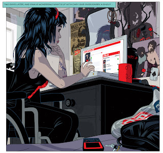
So here's a look at how I went about creating some of the elements that are currently hanging on the wall of the room where Gina spends much of her time when she's accessing the cyberworld of Cloud 109. The idea is to make the real world elements as convincing as possible when the three lead characters, Cary, Gina and Rabby appear as themselves rather than their fancy and various avatars. Gina at this stage of the story is trying to contact Cary and Rabby, but Cary's phone is off - familiar scenario, but she's going to try and access him via 'facefriendz'. I needed to make her environment a reflection of her character, out of all the three characters Gina is undoubtedly the coolest and savviest, wheelchair or not. Her room and most importantly her dresser, where she has her Ibook propped open has to hint at a life beyond what the reader may see in the pages we present to them. All characters to have any kind of conviction in a work of fiction have to contribute themselves to the plot but nevertheless exist independently of what the reader encounters and not act as mere cyphers, this is every bit as important in the artwork as in the writing. You should really care about your characters and obsess just a little bit about their lives beyond what the reader gets to see and ask yourself what makes them tick.

Part of what makes Gina tick is her undoubted Goth chic, her tastes in music, fashion and the the kind of rock n' roll iconography that would appeal to such a girl. Not beyond the bounds of possibility that she'd be into The New York Dolls and Mr Johnny Thunders, who comic afficionados may know, took his moniker from the character "Johnny Thunder" a western comic drawn by the phenomenally talented Alex Toth and written by Robert Kanigher (who you'll doubtless recall as editor from hell of D.C's war comics).

So a Johnny Thunders poster adorning the wall behind that rather nice mirror would be in order. The image of Thunders as rock n roll martyr being the one to go with as opposed to one of the one's towards the end of his life when the ravages of a serious heroin addiction were all too plain to see.

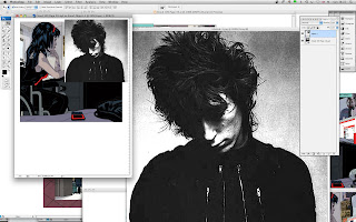
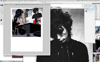
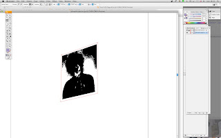
So step one you snaffle up your source image and import it into Photoshop adjusting the contrast and increasing the pixel count if necessary so as to preserve as much information as possible before subjecting it to conversion from bitmap to vector later on. You can have both Illustrator and Photoshop which you will need for this exercise running concurrently via Adobe Bridge. Now you open up the image that you will be dropping your poster into. You then use the Photoshop distort tool, which is a function nigh on impossible to replicate in Illustrator - hence us using Photoshop and twiddle the thing around until you've got it working in perspective. You then drag the perspectified Johnny into a new image in Photoshop and you save it.

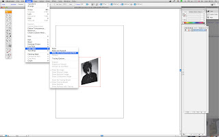
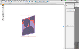
Right now hop over to Illustrator and open up your image with Gina, dresser, wall etc and now open up the perspectified Johnny image. Select with the selection tool (top left hand side of toolbox - yup - you've got it!) and then drag down from Object and choose Live Trace - Make and Convert to Live Paint.

Bingo you've got Johnny all raring to go as a nifty looking vector. Keeping the image selected then go into the transparency toolbox should be on your right hand side and choose - Multiply, which will get rid of that nasty white surround which isn't going to look at all good on your artwork. You can then further adjust the transparency by fiddling with the opacity slider. When you're satisfied with the results create another layer underneath and make a base colour for the poster.

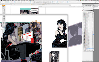
Then create a layer in the image of Gina with dresser and going back to your Johnny image, select all the layers that you have created and drag them onto your host image and carefully position just behind that mirror.

Mission accomplished and tomorrow I'll see what else we can surprise you with.